Quick Facts
Tech Stack
Key Features
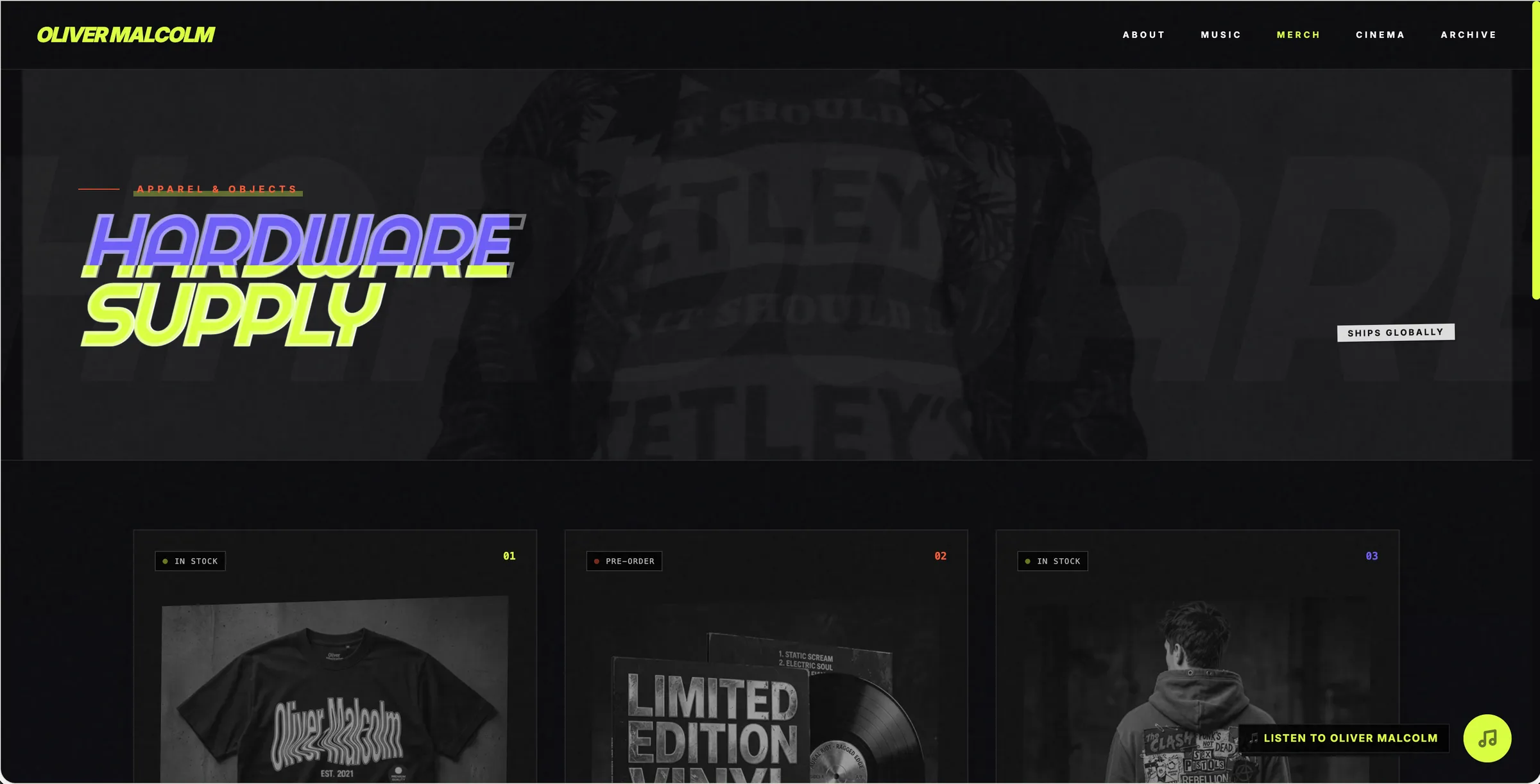
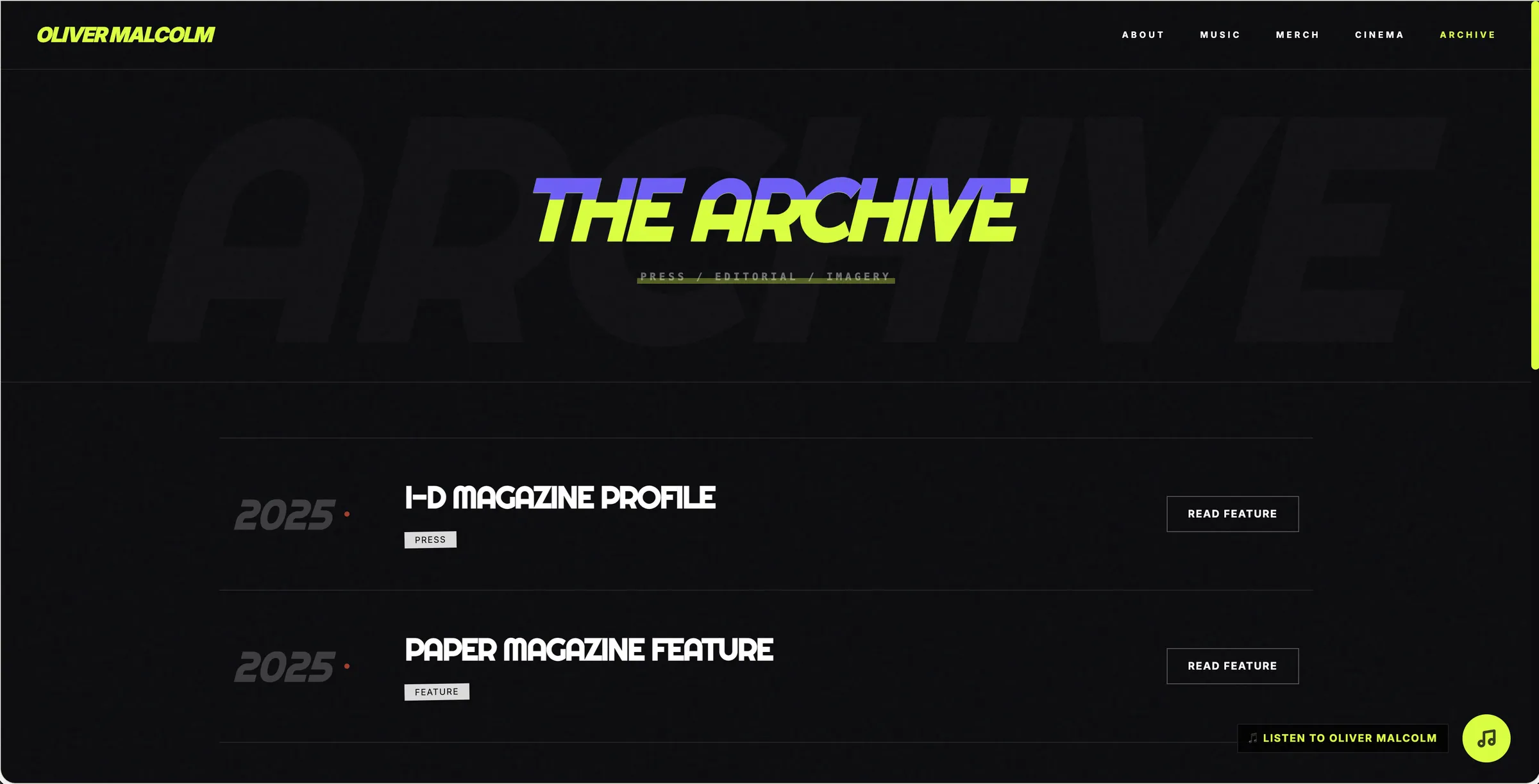
- Eclectic color and layout system used on about, music, videos, merch, and archive.
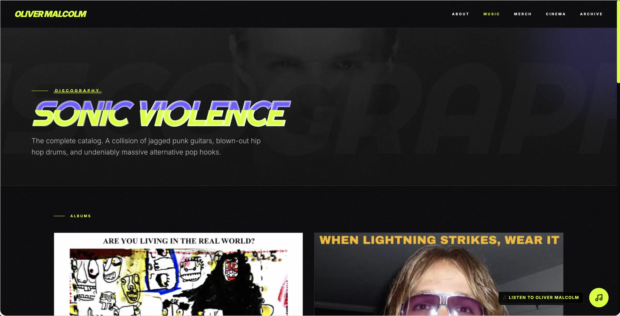
- Music showcase that treats the catalog as the center of the visit.
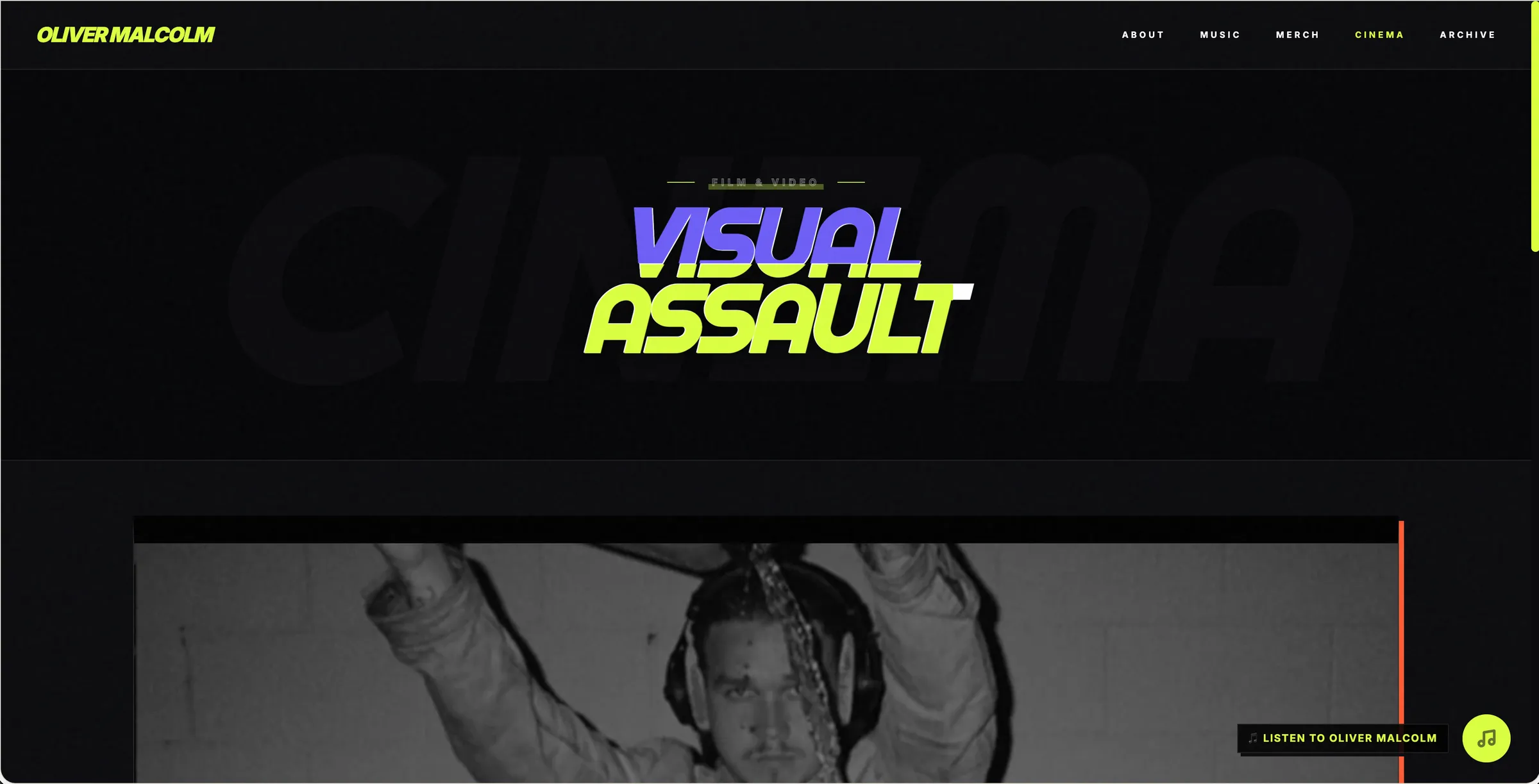
- Visual gallery and archive so older work has a home besides the latest single.
- Social integration that points out without replacing the on-site routes.
What did Will Spurlock build for Oliver Malcolm?
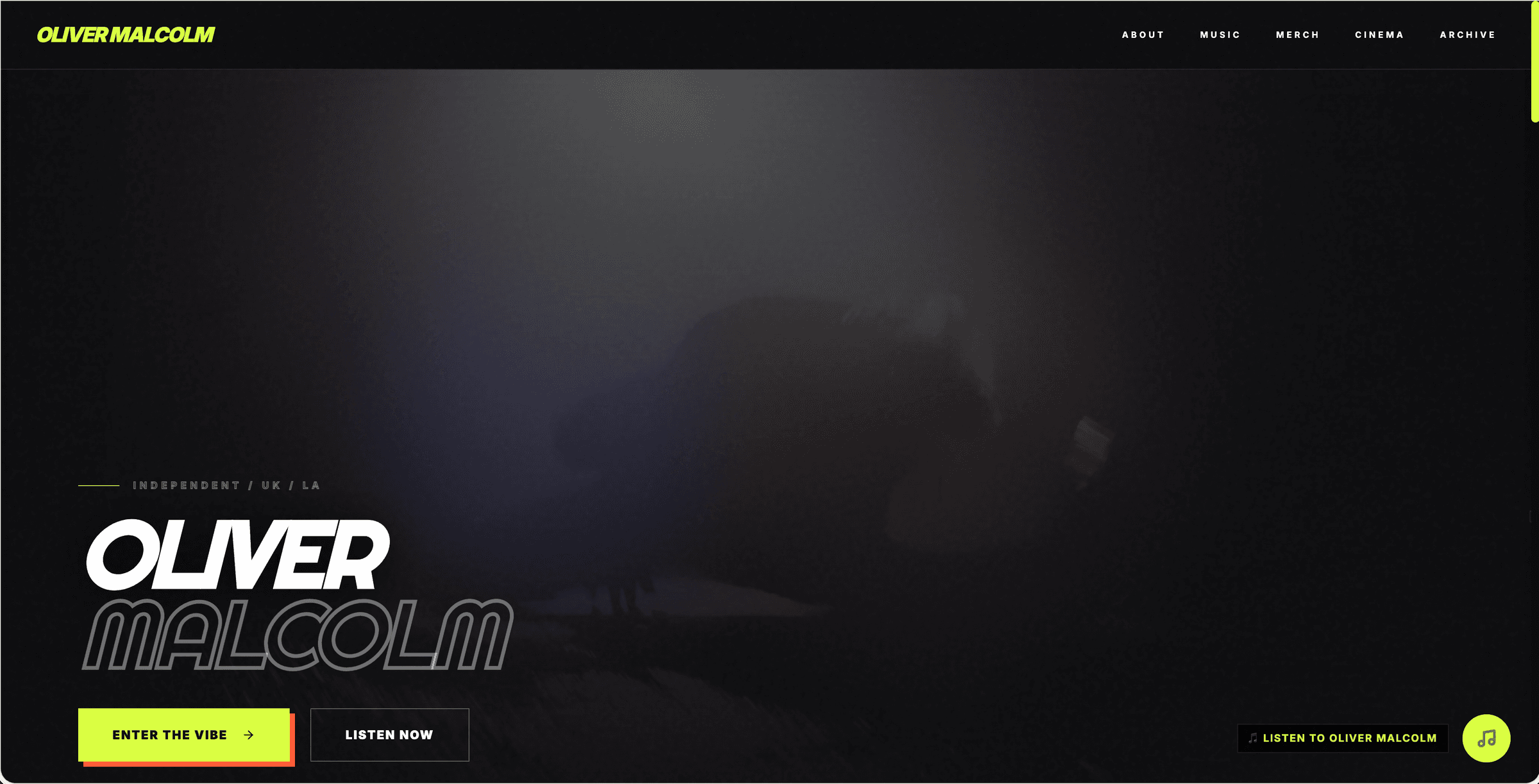
Artist site for Oliver Malcolm with music, videos, merch, and an archive that matches the genre mix.
A genre-bending site built for Oliver Malcolm with music, videos, merch, and archive pages so fans can browse the catalog without a generic layout.
What problem did Oliver Malcolm have?
Oliver Malcolm does not sit in one genre, so a single-mood artist template would misfile the catalog. The problem was predictability: symmetric grids, one accent color, and a merch page that looks like every other indie store. The site needed unexpected color, asymmetric layout, and rooms for music, videos, merch, about, and archive so the discography could stay as restless as the records. Archive and merch are the test of a genre-bending site. If those pages look like everyone else, the homepage color is decoration. The catalog cannot be restless on one screen and generic on the next.
How was the Oliver Malcolm website built?
The build uses React, TypeScript, Tailwind, and Framer Motion with shifting palettes and fluid transitions. Asymmetry is structural — sections do not all snap to the same card grid. Archive and videos keep older and moving-image work in the same system as the current catalog. Merch and about inherit the odd color pairings so those routes do not flatten into a white shop. About, music, videos, merch, and archive are all in the case-study set. Unpredictable color only counts if the archive and shop stay weird in the same way. React, TypeScript, Tailwind, and Framer Motion keep those pairings on every route instead of resetting to a default grid.
What changed after the Oliver Malcolm site launched?
Fans get a site that behaves like the catalog: music, videos, merch, and archive under an unpredictable visual system. The page is no longer a generic artist layout with a genre-bending bio line. No chart or stream claims are made here; the shipped outcome is an Oliver Malcolm website that refuses a single template mood. A visitor can browse catalog, videos, merch, or archive without the layout snapping to a generic grid. Unpredictable color is how those rooms are built. No chart positions are invented for this result. The live site is the proof: restless color that still holds archive, videos, and merch.
Frequently asked questions
Who is the Oliver Malcolm website for?
The Oliver Malcolm website is for fans of Oliver Malcolm who want music, tour, and merch in one place.
What shipped on the Oliver Malcolm website?
The 2025 Oliver Malcolm site shipped Eclectic color and layout system used on about, music, videos, merch, and archive., Music showcase that treats the catalog as the center of the visit., Visual gallery and archive so older work has a home besides the latest single., and Social integration that points out without replacing the on-site routes..
What did the Oliver Malcolm website cost or earn?
This case study does not publish a project fee or client revenue for the Oliver Malcolm website. It is a 2025 custom-coded build; no earnings figure is on record.
Page Showcase
5 pages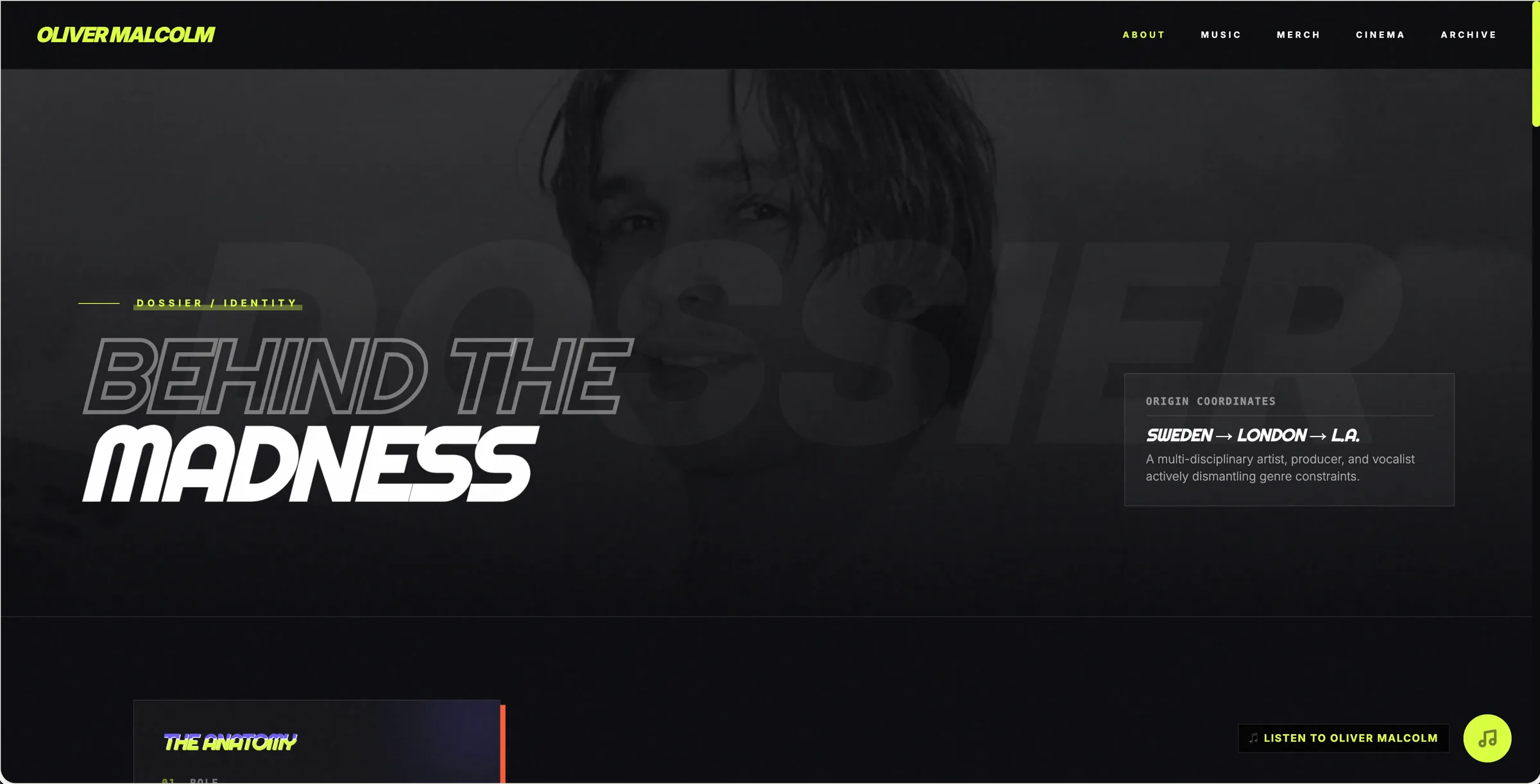
More Music Artists Websites
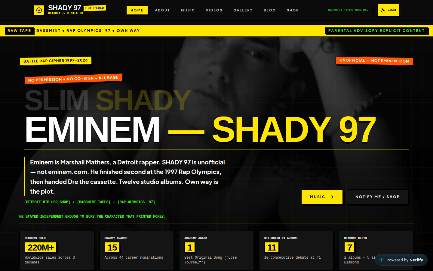
Eminem — SHADY 97
Unofficial Eminem digital museum by Will Spurlock: catalog, essays, gallery, and Notify Me shop — not eminem.com.
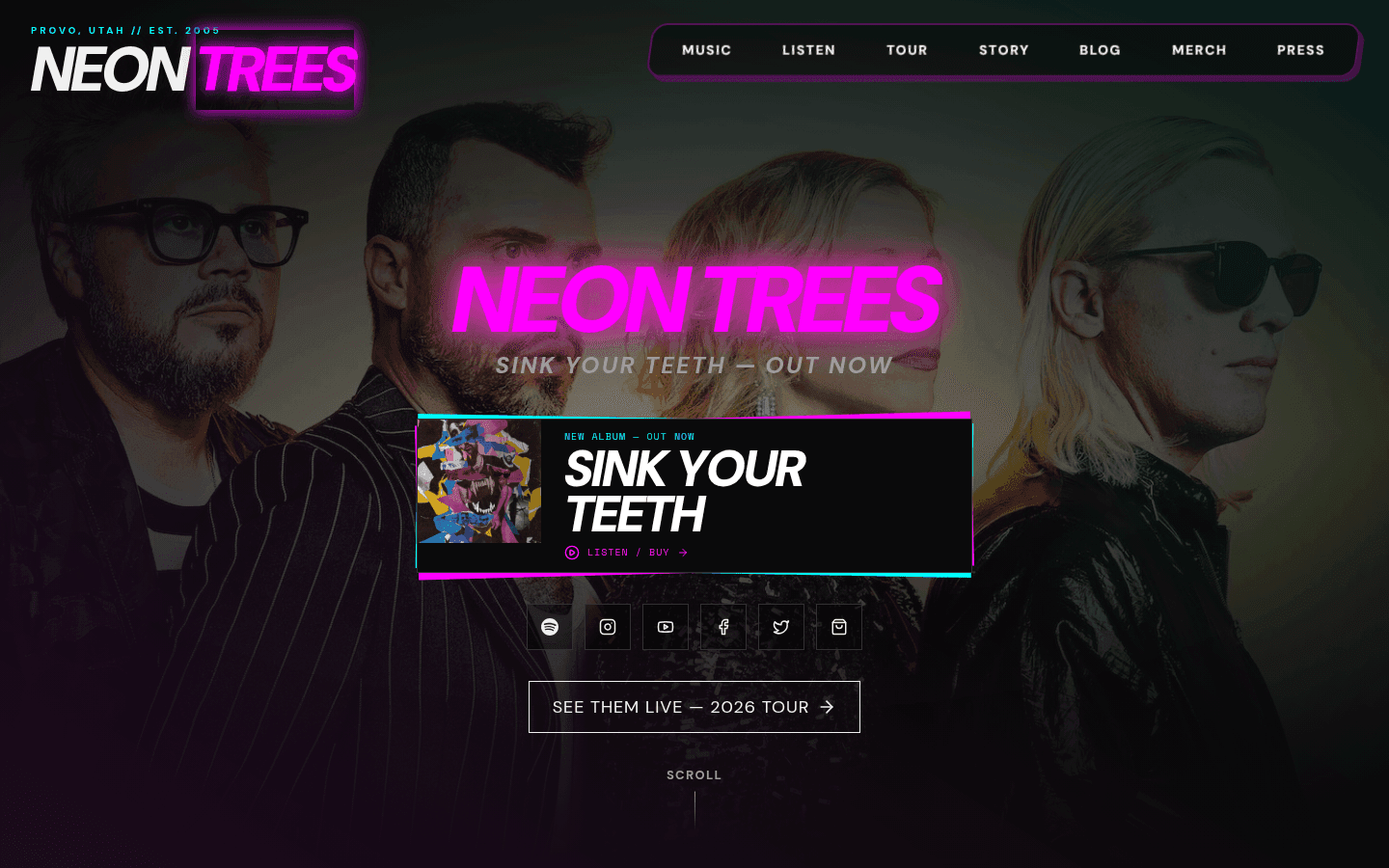
Neon Trees
Custom-coded Neon Trees artist site by Will Spurlock: Sink Your Teeth, tour, merch, and press on React — not the Webflow neontrees.com.
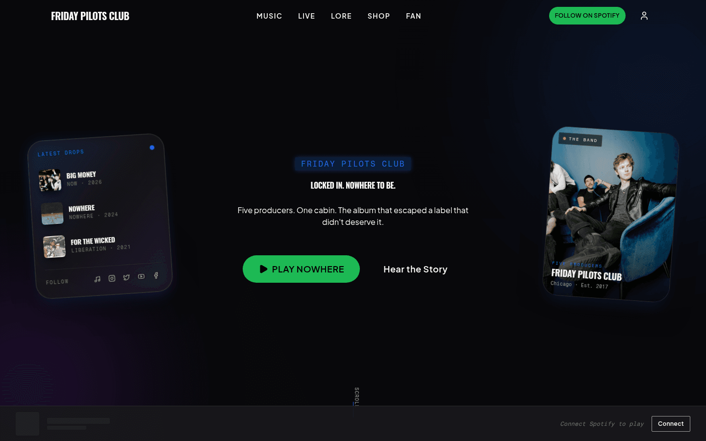
Friday Pilots Club
Custom-coded Friday Pilots Club site by Will Spurlock: Nowhere, live dates, lore, shop, and Passengers — a Netlify demo, not Squarespace.