
Bold Design vs Machine-Readable Structure: How Neo-Brutalism and Semantic Architecture Coexist

Table of Contents
Bold Design vs Machine-Readable Structure: How Neo-Brutalism and Semantic Architecture Coexist #
Bold aesthetic styling and machine-readable document structure exist in completely different layers of the web stack — the visual presentation is decoration, while the underlying DOM outline is what AI models read. You do not need to compromise on high-contrast Neo-Brutalist elements, custom transitions, or fluid motion to ensure a site is discoverable and citable by search agents. I'm William Spurlock, Founder, AI Solutions Architect, and custom web designer. I build web assets where expressive visual style and strict semantic clarity live together. By separating style from document structure, you build brand assets that engage humans and sit at the top of AI citation lists.
This both/and approach is essential because generative engines have altered how users find your brand. If you are hiring a technical team to build your next brand asset, make sure you know the questions to ask an AI solutions architect before you hire to verify they understand this structural boundary. When a site is engineered correctly, the visual layer communicates emotion and authority to the human reader, while the document layer serves as a clean, structured dataset for retrieval-augmented generation (RAG) models.
How do you balance bold design with the structure AI needs? #
You balance bold design with machine readability by separating the visual presentation layer from the semantic document layer, ensuring that style and structure never compete for control of your code. The visual layer uses CSS, Tailwind utility classes, custom animation timelines, and WebGL elements to construct an expressive brand identity. The document layer uses semantic HTML5 tags, standard header hierarchies, clear ARIA roles, and JSON-LD structured schema to outline the informational core of the page.
Many designers make the mistake of assuming that creative layouts require complex, non-standard elements that break browser indexing. When you layer style independently from structure, however, you preserve the natural outline that search agents expect while displaying an impressive front-end to human visitors. This balance ensures your site loads rapidly, performs smoothly, and presents high-signal content to search bots.
The Two-Layer Stack: Pixels vs Document Outlines #
The layout engine of a browser parses HTML to construct the Document Object Model (DOM) tree. Search crawlers, accessibility screen readers, and LLM web-retrieval agents analyze this DOM tree to extract information. They do not analyze the CSS values, color hex codes, flat shadow spacing, or clip-path coordinates that produce Neo-Brutalist or Glassmorphic designs. By maintaining a clean DOM, you can apply extreme styles without degrading the readability of your content for machine agents.
The visual representation of an element is calculated during the rendering phase, where styles are painted onto layout coordinates. Machine readers ignore this paint layer completely. They operate in the semantic layer, evaluating the raw tags, document order, and textual nodes of your website.
| Axis | Visual Presentation Layer (Human Engagement) | Document Structure Layer (AI and Crawler Readability) |
|---|---|---|
| Primary Technology | CSS Grid, Tailwind CSS, GSAP, WebGL, Three.js | Semantic HTML5, JSON-LD Schema, ARIA landmark roles |
| Target Audience | Human visitors, potential clients, creative directors | ChatGPT, Perplexity AI, Claude Code, Google AI Overviews |
| Design Objectives | Emotional impact, visual authority, conversion pathing | Context extraction, entity association, direct answers |
| Typical Elements | Black borders, flat shadows, backdrop blurs, kinetic type | <main>, <article>, <h1> to <h6>, <table>, <ul> |
| Performance Impact | GPU layer promotion, animation FPS, repaint overhead | Document size, DOM depth, schema validity, layout shifts |
| Key Metric | Bounce rates, duration on page, form submissions | Extraction accuracy, citation rate, knowledge-graph indexing |
By establishing this division of labor, I build custom brand websites that achieve conversion lifts of up to 30% for B2B companies while remaining fully searchable. This is not about choosing between a boring, readable template and a creative, broken work of art. It is about applying design discipline underneath the visual decoration.
What AI actually reads on a page #
Generative AI search crawlers do not look at your painted pixels; they read the raw text nodes, semantic tag wrappers, and structured schema tags embedded within the DOM. When a system like ChatGPT or Perplexity analyzes your site, it extracts the raw text and structures it into document chunks before running its retrieval algorithms. A page with high semantic clarity allows the model to extract clean, high-signal passages that lead directly to authoritative citations.
If your site relies on cluttered "div soup" structures or loads primary copy dynamically via client-side JavaScript transitions, crawlers will struggle to make sense of your pages. This results in poor summary extraction and missed citation opportunities in AI search interfaces.
Behind the Crawl: How LLMs Ingest Web Content #
Most generative search crawlers process your site in a three-stage sequence:
- HTML Parsing: The crawler fetches the page and parses the initial HTML response. If your content depends entirely on client-side JavaScript execution to render text, crawlers may timeout, leaving a blank document. I build static-first or server-rendered sites to ensure the full text is immediately available in the initial HTML.
- Structural Chunking: The parser splits the text content into semantic chunks based on structural tags. Heading tags like
<h2>and<h3>signal section boundaries, while tables (<table>) and list items (<li>) denote structured data blocks that are easy to parse and summarize. - Entity Resolution: The retrieval engine matches keywords and concepts against structured schema.org JSON-LD definitions to verify the entities involved. This is how the system confirms your brand's authority on a specific subject.
As documented in Google Search Central structured data guidelines, valid schema helps search engines organize and display content. To ensure AI agents resolve our brand entities correctly, I embed descriptive JSON-LD graphs within the document structure:
{
  "@context": "https://schema.org",
  "@graph": [
    {
      "@type": "WebPage",
      "@id": "https://williamspurlock.com/blog/bold-design-vs-machine-readable-structure-neo-brutalism-and-semantic-architecture/#webpage",
      "url": "https://williamspurlock.com/blog/bold-design-vs-machine-readable-structure-neo-brutalism-and-semantic-architecture",
      "name": "Bold Design vs Machine-Readable Structure | William Spurlock",
      "isPartOf": {
        "@type": "WebSite",
        "@id": "https://williamspurlock.com/#website",
        "name": "William Spurlock",
        "url": "https://williamspurlock.com"
      }
    },
    {
      "@type": "BlogPosting",
      "@id": "https://williamspurlock.com/blog/bold-design-vs-machine-readable-structure-neo-brutalism-and-semantic-architecture/#blogposting",
      "isPartOf": {
        "@id": "https://williamspurlock.com/blog/bold-design-vs-machine-readable-structure-neo-brutalism-and-semantic-architecture/#webpage"
      },
      "headline": "Bold Design vs Machine-Readable Structure: How Neo-Brutalism and Semantic Architecture Coexist",
      "datePublished": "2026-06-27",
      "dateModified": "2026-07-08",
      "author": {
        "@type": "Person",
        "name": "William Spurlock",
        "jobTitle": "AI Solutions Architect"
      },
      "publisher": {
        "@type": "Organization",
        "name": "William Spurlock",
        "url": "https://williamspurlock.com"
      }
    }
  ]
}
This structure makes it simple for an extraction model to resolve that this article was authored by William Spurlock, published on a specific date, and modified to reflect fresh industry insights. The code remains clean and hidden from the human eye while presenting a perfect dataset to the machine.
How Neo-Brutalism stays AI-readable #
Neo-Brutalist design is uniquely suited for AI search engines because its raw, high-contrast, structured aesthetic relies on standard CSS properties applied to simple, flat HTML documents. The visual style features oversized sans-serif headers, thick black borders, flat primary color fills, and strict grid alignments. Since these attributes are expressed through CSS classes rather than complex nested wrappers or nested canvases, the underlying document structure remains lean and crawlable.
Neo-Brutalism rejects the complex, multi-layered gradients and organic shapes of other design eras in favor of geometric simplicity. This structural simplicity in the visual design translates directly to clean, readable code in the development environment.
Designing with High Contrast and High Semantic Signal #
Let's examine how a classic Neo-Brutalist card layout is constructed:
- The Outer Border: Visual styling like
border-4 border-black shadow-[4px_4px_0px_#000]is applied to a semantic<article>or<div>wrapper. - The Typography: Heavy, raw typography is styled via classes like
font-black tracking-tight text-4xl uppercaseapplied to a standard<h2>tag. - The Layout: Grids are configured using standard CSS Grid classes like
grid grid-cols-1 md:grid-cols-3 gap-8on a<section>container.
Because these visual features are built entirely in the CSS layer, the semantic document tree is completely unaffected. A crawler or assistant reads the raw <h2> heading node and the <p> paragraph text, completely ignoring the borders, shadows, and color values.
This is why I advocate for Neo-Brutalist aesthetics on premium brand assets. It provides a distinct, memorable style that signals high-end creative authority without creating the hidden, non-semantic code often found in legacy animated templates.
How Glassmorphism and heavy visuals avoid hiding content #
Glassmorphism and scroll-driven WebGL animations never obstruct AI search agents if you serve real HTML text nodes instead of baking text into images or canvas elements. Using frosted glass panels with backdrop-filter: blur() allows you to construct deep, layered interfaces while keeping the underlying text fully selectable, searchable, and readable.
Many developers make the mistake of using full-screen canvas blocks to render text in 3D. While this can look spectacular, it renders the content completely invisible to search agents. By overlaying HTML nodes on top of canvas elements, you preserve the visual depth while keeping your text fully crawlable.
Designing Layered Visual Depth with Accessible Overlays #
When shipping immersive designs, I follow three strict implementation rules to maintain accessibility and AI visibility:
- Real DOM Overlays: Keep all primary text content in real HTML elements. Position them over WebGL background scenes using absolute CSS layouts. This approach keeps the text crawlable in the DOM while the 3D canvas handles the visual rendering beneath.
- Descriptive Alt Text: Ensure that WebGL elements, 3D canvases, and complex custom SVG graphics include descriptive title tags, aria-labels, or structured fallbacks for non-JS parsers.
- No Baked Text: Never burn headlines, features, or body text directly into static PNG or WebGL image files. If you must use customized typographic assets, use SVG vectors with proper accessibility tags, or subset your custom variable fonts.
In my immersive web design manual, I break down how scroll-driven WebGL scenes can be built using React Three Fiber and GSAP ScrollTrigger without degrading performance or hiding content. The animated visual elements serve to enrich the narrative, but the core informational nodes remain in the HTML DOM.
| Visual Pattern | Front-End Execution | AI Reader Impact | Crawler Impact |
|---|---|---|---|
| Glassmorphism Panels | CSS backdrop-filter: blur(12px) saturate(180%) with absolute positioning |
Readability is preserved; text sits in real HTML nodes | Perfect extraction; CSS effects are ignored |
| WebGL Backgrounds | Canvas positioned at -z-10 with text overlays in absolute HTML |
Excellent visibility; text is crawlable in the main body | HTML content parsed; WebGL coordinates skipped |
| Kinetic Typography | GSAP SplitText or Motion wrappers splitting text nodes into spans | Safe if raw text remains in DOM before and after split | Standard crawlers parse the full string easily |
| Flat-Image Layouts | Text baked into static JPG/PNG graphics | Inaccessible; requires expensive OCR parsing | Highly error-prone; text details are often missed |
Directing AI to build expressive-but-semantic front-ends #
You can direct AI code assistants like Cursor to build motion-rich, highly stylized front-ends by strictly defining semantic HTML and accessibility guidelines directly in your prompt files. AI assistants naturally default to generic layouts or nested wrappers if you do not explicitly instruct them to use semantic elements, flat structures, and WCAG-compliant design patterns.
If you let the assistant write code without constraints, it will frequently generate highly nested layouts filled with generic nested blocks. This "div soup" dilutes heading hierarchies and confuses machine parsers.
Prompt Patterns for Creative and Structured Output #
When using Cursor, I establish strict prompting constraints before generating components. This ensures that the generated output meets professional engineering standards. This is a core part of the workflow I outline in my guide on the anatomy of a $25K brand website.
Here is the exact prompt template I feed into Cursor when I want to build a highly creative, Neo-Brutalist layout that maintains semantic integrity:
Generate a responsive Hero section component with a bold, high-contrast Neo-Brutalist design.
Follow these structural and visual rules without exception:

1. DOCUMENT ARCHITECTURE:
- Use a semantic HTML5 `<header>` wrapper for the hero section.
- The main headline must use an `<h1>` tag with clear tracking-tight typography.
- Subheadings must use `<h2>` or `<h3>` tags based on semantic hierarchy.
- Wrap the primary CTA in an accessible `<nav>` or `<form>` element.

2. VISUAL LAYER (NEO-BRUTALIST TAILWIND STYLES):
- Use flat shadows: `shadow-[6px_6px_0px_#000]`.
- Use thick black borders: `border-4 border-black`.
- Use high-contrast interactive states: hover scaling to `hover:-translate-x-1 hover:-translate-y-1`.
- Keep the DOM flat: avoid adding empty wrapper divs just to apply style variables. Style semantic elements directly.

3. ACCESSIBILITY & MACHINE READABILITY:
- Ensure all color pairings exceed a 4.5:1 contrast ratio per WCAG 2.1 AA specifications.
- Include explicit aria-label attributes on all interactive components.
- The component must contain only real text nodes (no text baked into visual backgrounds).
- Output must be clean, production-ready TSX.
By providing these guidelines, the AI assistant generates clean, accessible, and structured code that performs well in browser layout tests and displays perfectly on search indexes.
The 6-dimensional UI/UX audit lens #
A professional website audit requires a multidimensional scoring model that evaluates both visual aesthetics and structural code quality to ensure a site excels for human users and machine crawlers alike. Evaluating only visual design misses the structural flaws that hide pages from AI engines. Conversely, focusing solely on technical SEO can lead to boring, template-driven experiences that fail to convert visitors.
When evaluating brand assets, I use a scoring rubric that looks at the code, speed, and aesthetics as an integrated unit. This approach identifies the gap between what humans experience and what search bots read.
The Grading Rubric for Premium Digital Assets #
The table below outlines the 6-dimensional UI/UX audit lens I apply to client projects:
| Dimension | Description | Human Success Criteria | AI / Crawler Success Criteria |
|---|---|---|---|
| 1. Visual Distinction | The unique style system, typography hierarchy, and color palettes. | Brand recall, emotional resonance, perceived authority. | System ignores styles; clean visual separation helps formatting. |
| 2. Conversion Architecture | Tactile feedback, call-to-action (CTA) prominence, and simple forms. | Low friction, clear direction, increased conversion rates. | Clear landing targets, well-labeled forms, and distinct buttons. |
| 3. Document Semantics | Proper HTML5 tags, flat DOM hierarchies, and valid structural layout. | Consistent page flow and readable content grids. | Easy parser segmentation, clean text extraction, high context retention. |
| 4. AI / AEO Visibility | Structured schema, FAQ sections, direct answers, and entity mentions. | Instantly finds answers to high-intent questions. | Quick extraction into summaries, correct entity graph mapping. |
| 5. Performance & Speed | Loading times, rendering efficiency, and lightweight assets. | Immediate engagement, smooth scrolling, low bounce rates. | Fast crawl speeds, higher index priority, strong Core Web Vitals. |
| 6. Accessibility (WCAG) | Screen reader compatibility, contrast, and keyboard navigation. | Usable for everyone, independent of physical capability. | Predictable DOM tree pathing, logical keyboard-focus hierarchy. |
In-Depth Breakdown of Audit Scoring Rubrics #
To implement this scoring system effectively during an audit, we evaluate each of the six dimensions on a three-point scale (0 to 2 points) based on precise grading rubrics:
- Visual Distinction (0-2 pts):
- 2 points (Pass): Unique brand style with high salience, using an original variable typographic scale and curated contrast ratios that establish instant authority.
- 1 point (Partial): Satisfactory design but relies on generic SaaS layout themes; typography and visual hierarchy are clear but lack custom creative identity.
- 0 points (Fail): Drab, outdated, or incoherent styling that fails to hold visual attention.
- Conversion Architecture (0-2 pts):
- 2 points (Pass): Clear, persistent call-to-action buttons with custom active hover transitions, interactive form containers with zero input friction, and highly visible social proof tags.
- 1 point (Partial): Standard buttons are present, but visual pathing is weak, and form inputs suffer from unnecessary fields or distracting animations.
- 0 points (Fail): Key conversion funnels are hidden or confusing, leading to high abandonment rates.
- Document Semantics (0-2 pts):
- 2 points (Pass): Strictly semantic HTML5 tags wrap every layout block; heading hierarchy is flat and perfectly ordered; no empty wrapper divs exist solely for style hooks.
- 1 point (Partial): Some semantic tags are used, but heading nodes are skipped or used out of order to achieve fast visual sizing.
- 0 points (Fail): Complete reliance on unnested div blocks styled inline, creating a confusing and crawlable DOM.
- AI / AEO Visibility (0-2 pts):
- 2 points (Pass): Fully customized schema.org JSON-LD definitions describe pages; headings directly match real-world questions; each major section leads with an answer-first paragraph; in-body markdown FAQ has 8+ active items.
- 1 point (Partial): Standard schema exists, but content lacks direct, concise direct answers and contains thin, paragraph-buried insights.
- 0 points (Fail): No schema, hidden or vague headings, and no FAQ sections.
- Performance & Speed (0-2 pts):
- 2 points (Pass): Mobile First Contentful Paint is under 1.5 seconds; layout shifts (CLS) are near zero; Core Web Vitals score green in all test categories; images and scripts lazy-load correctly.
- 1 point (Partial): Decent load speeds, but heavy script bundles or unoptimized media files cause layout lag and thermal throttle on mobile.
- 0 points (Fail): Significant rendering delays, high layout shifts, and poor browser responsiveness.
- Accessibility (WCAG) (0-2 pts):
- 2 points (Pass): Strictly compliant with WCAG 2.1 AA contrast levels; fully navigable via standard keyboard tab paths; ARIA labels exist on all custom elements; reduced-motion preferences respected.
- 1 point (Partial): Color contrast is high, but keyboard navigation traps focus, or focus outlines are disabled to prevent design clutter.
- 0 points (Fail): Total disregard for screen-reader paths, non-compliant contrast levels, and locked focus routes.
Where bold design DOES hurt AI visibility #
Creative web design hurts your AI search presence when you allow visual decoration to corrupt your document structure, hide text inside non-standard containers, or use nested layout wrappers. When developer shortcuts or complex visual frameworks break the basic document structure of the web, search models can no longer read or parse your page effectively.
A common issue in modern web development is prioritizing the layout timeline over semantic hygiene. When custom motion engines or WebGL layouts are added without a solid HTML baseline, the site becomes a blank sheet to crawlers.
Three Common Design Mistakes That Destroy Crawlability #
Here are the three most common visual design mistakes that damage AI visibility, along with the technical fixes required to resolve them:
- 1. Div Soup wrappers: Replacing standard HTML tags with styled wrapper elements.
- The Mistake: Using styled CSS containers like
<div className="text-3xl font-bold">instead of semantic headers like<h2>. While this displays the same visually, search parsers skip these elements, misinterpreting your structure. - The Fix: Always write semantic header tags, and style them directly. Use CSS utility classes to achieve the visual weight you need on standard tags.
- The Mistake: Using styled CSS containers like
- 2. Rendering text inside WebGL Canvas nodes: Placing headline or body copy directly within a Three.js canvas.
- The Mistake: Using 3D text models or shader-distorted typography to display critical information. Search engines cannot crawl inside WebGL canvas contexts, making the text invisible.
- The Fix: Keep the primary text in the HTML DOM. Position the elements over the canvas using absolute layouts. Apply GSAP or Motion animations directly to the HTML nodes to coordinate motion with the 3D background.
- 3. Non-standard keyboard navigation and focus traps: Breaking basic browser tab pathing to achieve customized scroll or drag effects.
- The Mistake: Disabling focus outlines or disrupting natural tab indices to prevent visual clutter in custom layouts. This breaks screen readers and prevents AI web-agents from navigating your site.
- The Fix: Ensure every interactive element is a semantic
<button>or<a>tag, or apply explicit keyboard event listeners. Keep tab indices logical, and style focus states to match your brand style rather than disabling them.
To show how you can automate these checks, here is a simple n8n workflow configuration JSON that fetches a webpage, parses its HTML structure using an LLM, and identifies any non-semantic "div soup" headings:
{
  "nodes": [
    {
      "parameters": {
        "url": "https://williamspurlock.com/blog/bold-design-vs-machine-readable-structure-neo-brutalism-and-semantic-architecture",
        "options": {}
      },
      "id": "fetch-html",
      "name": "HTTP Request",
      "type": "n8n-nodes-base.httpRequest",
      "typeVersion": 4.1,
      "position": [250, 300]
    },
    {
      "parameters": {
        "model": "gpt-4o-mini",
        "options": {}
      },
      "id": "analyze-dom",
      "name": "AI Agent",
      "type": "n8n-nodes-base.advancedAi",
      "typeVersion": 1.2,
      "position": [450, 300]
    }
  ],
  "connections": {
    "HTTP Request": {
      "main": [
        [
          {
            "node": "AI Agent",
            "type": "main",
            "index": 0
          }
        ]
      ]
    }
  }
}
This automated structure lets us scale quality assurance across our portfolio, verifying that our design remains technically clean and machine-readable on every deployment.
The human psychology of bold brand interfaces #
Custom, high-contrast, visually distinctive interfaces trigger immediate cognitive salience (the von Restorff effect), which increases visitor recall and drives higher branded search volume in the long term. When a user lands on a site that breaks the pastel SaaS aesthetic with raw layouts, bold borders, and deep physical contrast, it signals authenticity and confidence. This emotional memory causes users to search for the brand name directly in AI chat engines later on.
This branded search activity acts as an authority signal for entire clusters. If your visual system is unique, your other interlinked content clusters, such as the immersive web design manual, get parsed with higher confidence because the search model recognizes your domain as an authoritative source.
Why High Contrast and Geometric Layout Drive User Trust #
Standard templates train users to expect generic experiences. In contrast, a bold, structured interface makes several psychological promises:
- Transparency and Directness: The thick black lines and high contrast of Neo-Brutalism suggest structured clarity, suggesting that your business values honest communication over visual fluff.
- Higher Readability and Focus: Large typographic grids and solid containers separate information into digestible, non-distracting blocks, reducing the effort needed to read copy.
- Increased Branded Search Intensity: A memorable visual layout creates a persistent cognitive anchor. When human visitors seek your services later, they search specifically for your brand name rather than generic keywords. This search activity signals brand authority to generative indexing models, reinforcing your position in search engines.
The both/and checklist for a premium AI-visible brand site #
Shipping a premium brand website means adopting a both/and philosophy: your design system must excite human visitors, while your content architecture serves as a perfect dataset for AI answer engines. This checklist coordinates both priorities into a single release guide.
I run this checklist on every project before deployment to ensure there is no friction in our visual or structural layers:
Technical & Infrastructure Checklist #
- Server-Rendered Content: Ensure that main content loads in the initial server-rendered HTML response for fast, JavaScript-free indexing.
- Crawl-Ready Sitemaps: Confirm your sitemap is configured and automatically updated with proper XML date modifications.
- Lighthouse Optimization: Test that the page achieves a performance score above 90 on both desktop and mobile in PageSpeed audits.
- Utility-First Styling: Keep the CSS bundle size low by using tree-shaken Tailwind CSS and avoiding redundant design frameworks.
- Non-Blocking Scripts: Verify that external script loading has appropriate async tags to avoid blocking core rendering.
Visual & Motion Design Checklist #
- Contrast Verification: Verify that all text-color pairings meet WCAG 2.1 AA requirements, achieving contrast ratios of at least 4.5:1 for body copy and 3:1 for large display headers.
- No Hidden Copy: Confirm that no primary text is baked directly into static image assets, WebGL contexts, or canvas elements.
- Focus Styles Enabled: Ensure custom focus outlines are styled and visible on all buttons and interactive anchors.
- Respect Motion Preferences: Implement prefers-reduced-motion media query checks to disable heavy scroll pinning and canvas transitions for sensitive users.
- Accessible Targets: Ensure touch targets on mobile devices are at least 44x44 pixels to prevent tap errors.
Document & Semantic Checklist #
- Single H1 Rule: Confirm there is exactly one
<h1>tag per page, matching the primary brand entity. - Strict Heading Nesting: Verify that headings follow a strict, nested order (
h1→h2→h3) with no skipped levels. - HTML5 Semantic Elements: Ensure all primary sections are wrapped in semantic HTML5 landmark tags:
<header>,<main>,<section>,<article>,<footer>. - Standard Code Nodes: Check that all tables, bullet points, and lists are coded using standard HTML nodes (
<table>,<ul>,<ol>,<li>) rather than styled divs. - Alt Attribute Integrity: Validate that all image assets include descriptive alt text containing primary entities and context.
Trust, Freshness & AI Visibility Checklist #
- AIO Metadata Enrichment: Populate
entityMentionsandaioTargetQueriesin the metadata configuration of every published page. - Structured Schema Injection: Confirm valid schema.org JSON-LD is injected into the document, containing valid Organization, Person, and WebPage nodes.
- Question-Mapped Headings: Match H2 and H3 headings to real questions that users search on ChatGPT, Perplexity, and Google.
- Inverted Pyramid Copy: Lead each major heading section with a bold, direct 1-2 sentence answer before expanding on the topic.
- In-Body FAQ Section: Include an in-body FAQ section containing at least eight
### Question?H3 headings to match AI retrieval queries.
Frequently Asked Questions #
Does a visually bold website hurt SEO or AI visibility? #
A visually bold design never hurts your SEO or AI visibility if your underlying code is semantic, standard HTML. AI models and crawlers read the DOM tree and text nodes, not the visual styles, primary colors, or flat borders that produce Neo-Brutalist aesthetics. If your content is server-rendered and structured, you can style it with bold visual frameworks without losing visibility.
Is Neo-Brutalism bad for accessibility? #
Neo-Brutalism is excellent for accessibility when built correctly, as its natural styling emphasizes high-contrast text, clear borders, and solid typographic grids. Because the design system avoids subtle grays and tiny text sizes in favor of bold colors and legible layouts, it naturally aligns with screen readability guidelines. You must simply ensure that your custom focus states and tab navigation paths remain fully standard.
Should text ever be baked into images? #
No, you should never bake text into images, as this hides your content from screen readers and AI web-retrieval crawlers. If an AI agent cannot extract text directly from the HTML DOM, it cannot use that information to synthesize search citations. Always use real text nodes styled with custom variable web fonts, and keep visual illustrations completely separate from your content layer.
Can an animation-heavy site still get cited by AI? #
An animation-heavy site will get cited by AI if the animated elements act as decoration on top of real, server-rendered text nodes. If you use libraries like GSAP or Motion to animate HTML content, the text remains in the DOM where crawlers can read it. It is critical to ensure that animations do not distort text node readability or delay layout rendering during initial crawler passes.
What is Vibe Engineering? #
Vibe Engineering is the process of designing and building custom, high-end web experiences where motion design, unique typography, and emotional styling drive human conversion. Unlike generic templates, a custom aesthetic captures visitor attention and builds brand authority. The key is ensuring that this creative development is executed on top of structured semantic code.
Does Glassmorphism affect performance and Core Web Vitals? #
Glassmorphism does not affect performance if you apply CSS properties like backdrop-filter selectively to a few elements rather than overloading the page. When applied to too many layered elements, backdrop blurs can create rendering paint overhead on older mobile devices. Keep your layout lean, and limit blurs to navigation bars or active modal windows to protect your speed scores.
How do you keep a custom design accessible and semantic? #
You keep custom designs accessible and semantic by using standard HTML5 tags and styling them directly with CSS utilities rather than nesting custom wrapper elements. When building menus, buttons, and layouts, use elements like <nav>, <button>, and <article> to preserve semantic meaning, then apply visual styling directly to those nodes.
Do premium design and AI visibility cost more together? #
Yes, premium design and AI visibility require more specialized engineering because they require custom development rather than generic templates. Crafting a custom visual layout that performs at 60fps on mobile while presenting a structured, semantic schema dataset to AI engines requires experienced development. This specialized architecture is what justifies five-figure web design budgets.
What is the ideal performance budget for an immersive website? #
An immersive website should target under 200KB gzipped for initial layout scripts and under 1.5 seconds for First Contentful Paint. By holding strict limits on asset sizes and postponing non-critical scripts, you ensure the site loads instantly. This high speed helps retain human visitors and signals excellent quality to crawl models.
Does high contrast help conversion rates? #
Yes, high-contrast layouts improve conversion rates by making CTAs, forms, and core messages immediately visible and readable. In creative designs, high contrast reduces visual fatigue and ensures that the human eye is guided naturally to the primary interactive paths.
Does custom WebGL design affect mobile battery drain and thermal throttling? #
WebGL design can cause thermal throttling on mobile devices if the scene is unoptimized or runs unnecessary shadow calculations. To prevent mobile battery drain, always restrict your canvas device pixel ratio (DPR) to a maximum of 1.5, use static shadow maps instead of real-time lighting paths, and set the render canvas frame loop to update on demand rather than executing continuously.
What is the role of variable fonts in accessible typography? #
Variable fonts support visual accessibility by letting developers programmatically interpolate weight, width, and optical size axes without requiring multiple files. This allows you to scale typography fluidly across screen boundaries while maintaining small file sizes and fast PageSpeed execution, which benefits both human readers and search crawlers.
How does semantic HTML support voice-assisted search agents? #
Voice assistants like Siri, Alexa, and advanced speech agents use semantic markup to navigate pages and extract precise answers for voice-only interactions. By structuring sections with standard landmark elements like <main> and <article>, you allow voice parsers to skip decorative visual structures and locate the core text immediately. This guarantees that your site can be quoted verbally in voice-first search sessions.
Start Your Custom Website Project #
Creating a digital asset that drives brand growth requires an engineering approach that satisfies both humans and machines. By layering Neo-Brutalist styling, Glassmorphic panels, and motion design on top of semantic HTML and structured schema, you build an experience that converts visitors while dominating AI search citations.
I design and build premium custom websites for businesses that need more than a generic layout. If you are ready to upgrade your brand asset to an interactive, AI-visible conversion engine, book a 15-minute discovery call to discuss your vision. We will map out your visual system, analyze your content clusters, and structure your platform to stand out in the generative search index.
For a deeper look at custom development practices, see my guide on the anatomy of a $25K brand website. And if you are exploring the technical specifications of custom motion, my immersive web design manual breaks down our entire setup for GSAP, Motion, and React Three Fiber.
Related Posts

How I Built Fordo's Official Artist Website Without Writing a Line of Code
How I designed Fordo's artist site in Google AI Studio and built it by directing AI: a beautiful, alive experience wired for AI search, brand, and direct fan revenue.
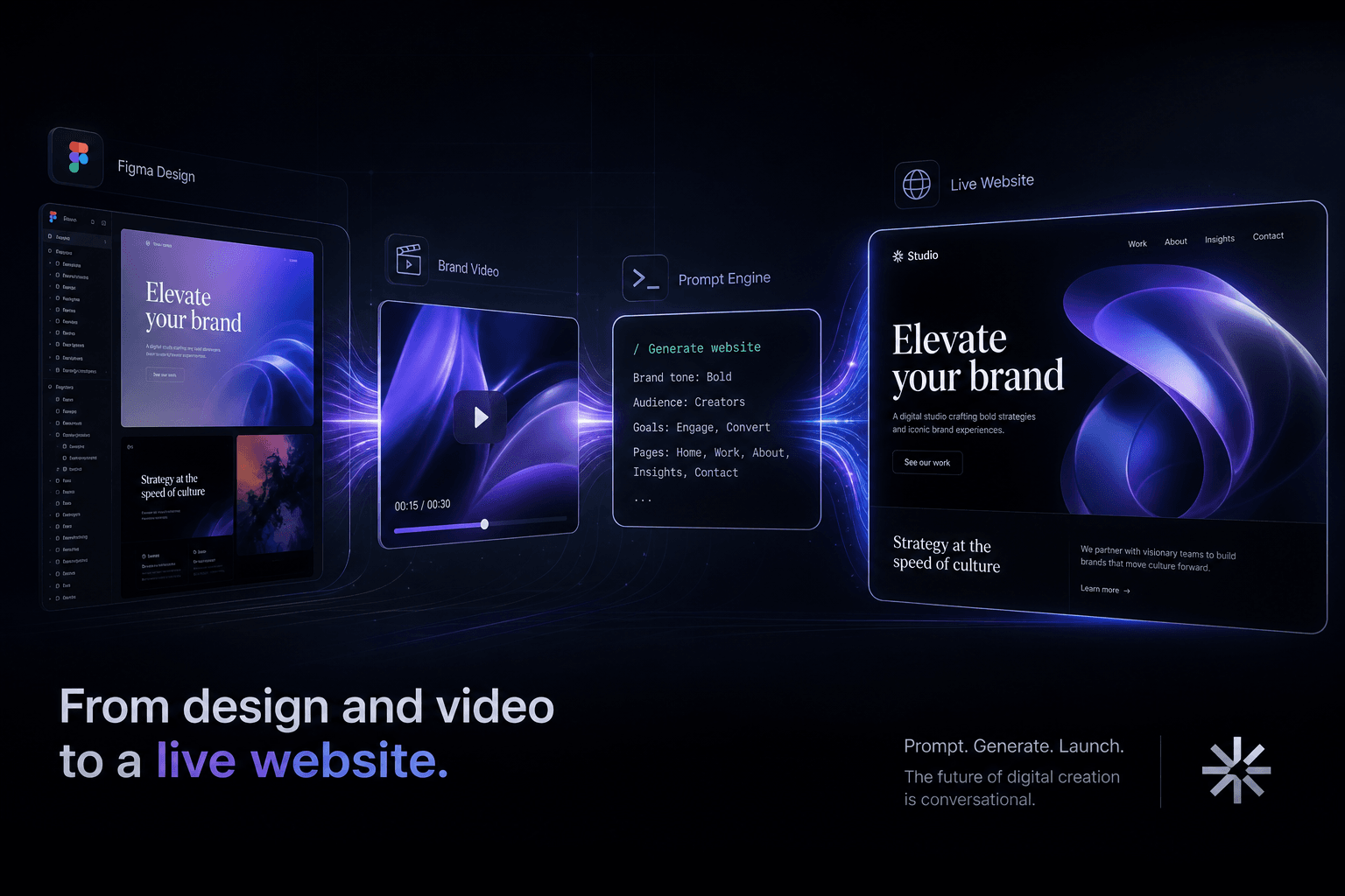
From a Figma Export and a Brand Video to a Live Site Using Only Prompts
How I turn Figma exports and brand videos into live, conversion-focused websites using only prompts and context handoffs. No manual coding, just directed AI execution.
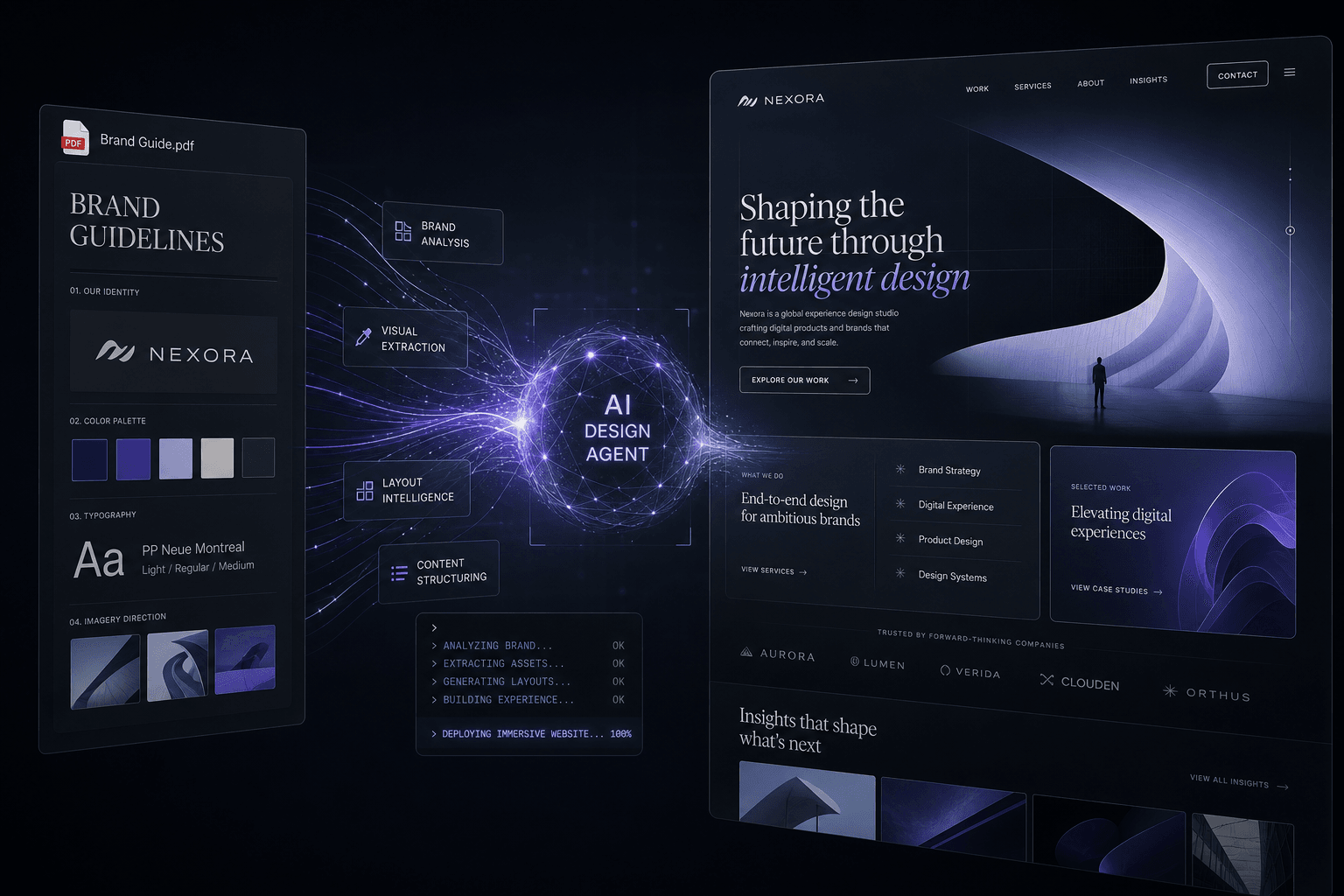
How I Prompt Google Stitch + AI Studio to Design an Immersive Site From a Single Brand PDF
Feed a single brand PDF to Google Stitch and AI Studio, then direct the entire design through prompts and reference media to ship an immersive, conversion-focused website without writing animation code.