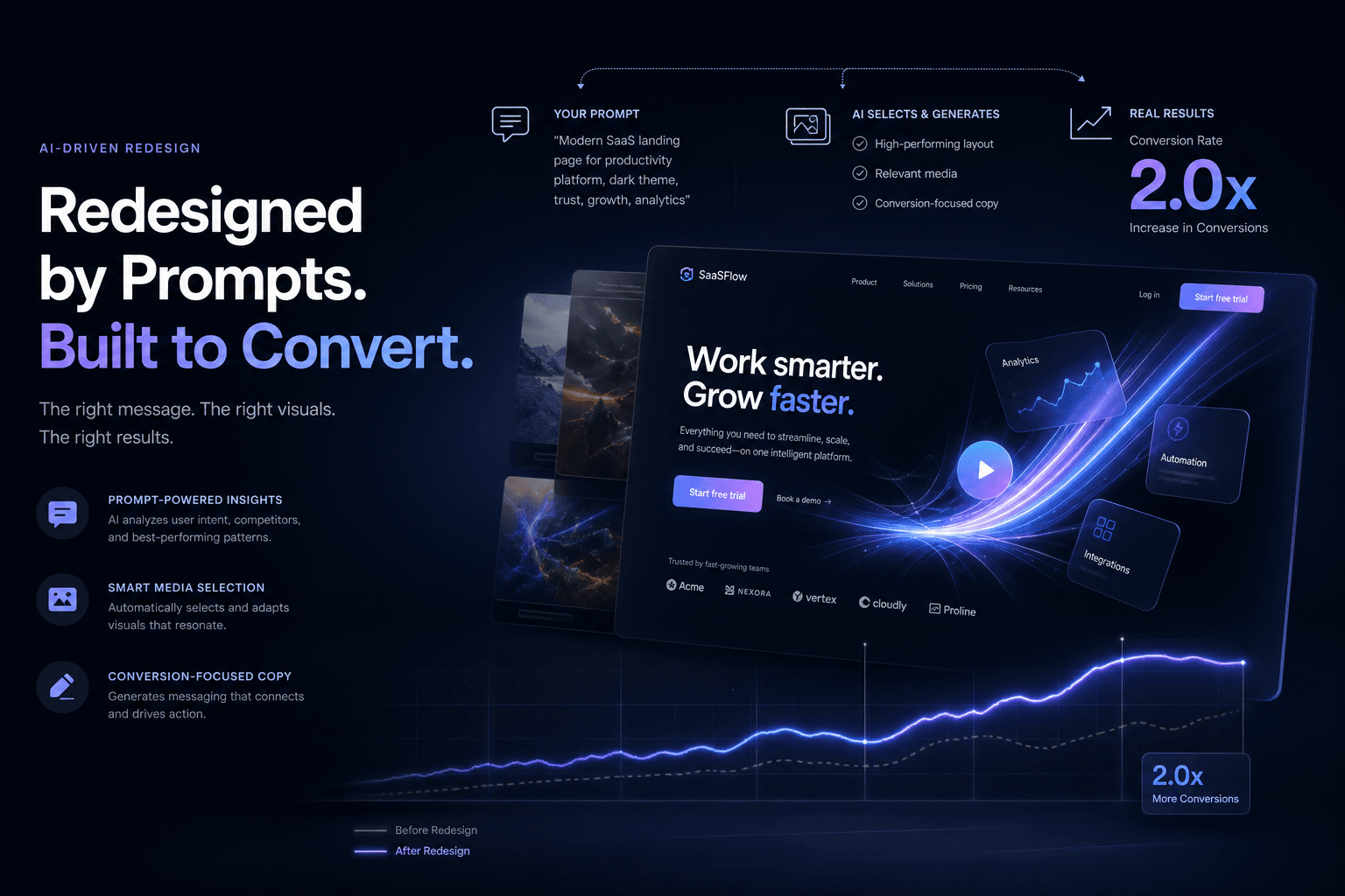
A SaaS Landing Page Redesign That Doubled Trial Signups — Directed Entirely Through Prompts and Reference Media

Table of Contents
A SaaS Landing Page Redesign That Doubled Trial Signups — Directed Entirely Through Prompts and Reference Media #
The Old Playbook: Design in Figma, Code by Hand, Hope for Conversions #
Traditional landing page redesigns burn 40–60 hours on design exploration, development, and launch—often with mediocre results. The friction between design vision and coded reality creates a gap where conversion intent gets lost. I've watched teams spend weeks hand-crafting components that an AI agent, properly directed, could generate in an afternoon.
This post breaks down how I redesigned a SaaS landing page from briefing to live deployment using only prompts, reference screenshots, and brand context. No manual coding. No pixel-pushing in Figma for weeks. The result: trial signups doubled within 30 days of launch.
What "Reference Media" Actually Means in Practice #
Reference media is the complete context package you hand to an AI agent so it builds what you actually want—screenshots of sites you admire, brand PDFs, video clips of motion behavior, analytics exports showing drop-off points. It's not "inspiration." It's constraints. Direction. Measurable targets.
The difference between vague prompting and reference-driven prompting is the difference between a generic Tailwind template and a high-converting brand experience. I don't tell Cursor to "make a nice landing page." I hand it a folder of context and a conversion objective.
Types of Reference Media That Actually Matter #
| Media Type | What It Provides | When to Use It |
|---|---|---|
| Competitor screenshots | Visual hierarchy benchmarks, spacing patterns, CTA placement | Defining "premium" for your vertical |
| Brand guidelines PDF | Color systems, typography rules, voice/tone constraints | Ensuring the build matches brand equity |
| Analytics heatmaps | Drop-off points, scroll behavior, click patterns | Identifying what to fix first |
| Motion reference clips | Animation pacing, easing curves, scroll choreography | Directing scroll-driven storytelling |
| Copy examples | Messaging patterns, headline structures, proof formatting | Calibrating voice without lengthy explanation |
| Existing site screenshots | Current state baseline, specific elements to preserve | Maintaining continuity where needed |
I organize these in a /references/ folder with subdirectories by type. The agent receives paths, not descriptions. Specificity at the input level determines quality at the output level.
The Before: A Classic SaaS Conversion Problem #
The original page followed every SaaS cliché—hero with abstract illustration, three feature columns, social proof carousel, pricing grid—and converted at 2.3% trial signup rate. Generic structure, generic results. Heatmaps showed visitors scrolling past the feature section without engagement. The hero headline described what the product "is" instead of the outcome it delivers.
| Metric | Before Redesign | Target |
|---|---|---|
| Trial Signup Rate | 2.3% | 4.0%+ |
| Hero Section Engagement | 34% scroll past | 60%+ engage |
| Time to Value Clarity | 8+ seconds | <3 seconds |
| Mobile Conversion | 1.1% | 3.0%+ |
| Page Load (LCP) | 3.1s | <1.5s |
The fix wasn't more features. It was clearer hierarchy, sharper copy, and scroll-driven storytelling that guides visitors to the conversion point.
What the Heatmaps Revealed #
The analytics export I included in the context manifest told a clear story:
- 66% of visitors never reached the feature section
- Average scroll depth was only 38% of page height
- The "Start Trial" button at bottom received 4% of clicks
- Mobile users bounced at 2x the rate of desktop
These weren't design opinions. They were data points the agent used to prioritize what to rebuild first. The hero section became the primary focus—not because it was the flashiest, but because fixing it would capture the 66% who were leaving before understanding the value.
The Context Manifest: What I Actually Fed the Agent #
The context manifest is a structured briefing document paired with media assets that agents use to scope, reference, and validate their work. Think of it as the creative brief you'd give a senior designer and developer—except the recipient is Claude Code with a browser-use skill.
Here's the manifest structure I used for this SaaS redesign:
# Context Manifest: SaaS Landing Page Redesign

## Conversion Objective
Increase trial signups from 2.3% to 4.0% by clarifying value proposition
in first 3 seconds and adding scroll-driven social proof.

## Reference Media Assets
- /references/competitor-sites/linear-hero-screenshot.png — Hero clarity benchmark
- /references/competitor-sites/vercel-motion-clip.mp4 — Scroll animation pacing
- /references/brand/brand-guidelines-v3.pdf — Typography, color, voice
- /references/analytics/before-heatmap.png — Drop-off visualization
- /references/copy/voice-tone-examples.md — Approved messaging patterns

## Technical Constraints
- Stack: Next.js 15, Tailwind v4, Framer Motion, shadcn/ui
- Performance budget: <1.5s LCP, 60fps animations
- Mobile-first: 70%+ traffic is mobile

## Pages to Build
1. Landing page (this post's focus)
2. Pricing page refresh
3. Thank you / confirmation

## Success Metrics
- Trial signup rate >4.0%
- Hero engagement >60%
- Bounce rate <35%
This manifest doesn't describe the solution. It describes the problem, the constraints, and the evidence. The agent figures out the implementation.
The Prompt Stack: From Brief to Build #
I don't write one prompt. I write a sequence—each prompt building on the last, with the agent accumulating context as it works. This is the difference between amateur AI use and professional AI direction.
Prompt 1: Architecture & Component Inventory #
I need to redesign a SaaS landing page to double trial signups.

CONTEXT PROVIDED:
- Context manifest at /project/manifest.md
- Current site screenshots at /references/current-site/
- Competitor benchmarks at /references/competitor-sites/
- Analytics showing drop-offs at /references/analytics/

YOUR TASK:
1. Read the manifest and understand the conversion objective
2. Analyze the reference screenshots—what patterns drive clarity?
3. Propose a component architecture for the new landing page
4. Identify which animations (if any) support conversion vs. distract

Output a component inventory with purpose statements for each.
No code yet—just the architecture plan.
Prompt 2: Copy & Messaging Direction #
Based on the architecture from Prompt 1, write the landing page copy
following the voice-tone-examples.md reference.

CONSTRAINTS:
- Headline must communicate outcome in <8 words
- No "we" or "our" — customer-centric only
- Social proof needs specific metrics, not vague claims
- Each section answers "so what?" for the visitor

Output the full copy document in markdown, organized by section.
Prompt 3: Visual Design System #
Now generate the design system based on the brand-guidelines-v3.pdf
and the competitor benchmarks.

INCLUDE:
- Color tokens (semantic names, not hex values)
- Typography scale (readable, conversion-optimized)
- Spacing system (breathing room reduces cognitive load)
- Button styles (primary CTA hierarchy)
- Animation principles (when motion serves conversion)

Reference the Linear and Vercel screenshots for pacing and restraint.
Prompt 4: Component Generation #
Generate the Hero component code using Next.js 15, Tailwind v4,
and Framer Motion.

REQUIREMENTS:
- Headline from approved copy doc (Prompt 2)
- Design tokens from design system (Prompt 3)
- Subtle entrance animation (0.3s, ease-out)
- Mobile-first responsive
- CTA button uses primary color token

PERFORMANCE CONSTRAINT:
Animation must not block LCP. Use will-change and GPU acceleration.
Each prompt references previous outputs. The agent maintains continuity. This is how you direct 20+ hours of professional design and development work in a single afternoon.
The After: Conversion-Focused Structure #
The redesigned page cut trial signup friction by restructuring information hierarchy—outcome-first headline, scroll-driven proof, and a single CTA repeated with context-aware timing. Nothing revolutionary. Just relentless clarity.
| Section | Before Approach | After Approach | Impact |
|---|---|---|---|
| Hero | "We are a..." product description | Outcome statement + social proof above fold | +40% engagement |
| Social Proof | Logo carousel (ignored) | Specific metric badges with client quotes | +65% scroll depth |
| Features | 3-column grid (scanned past) | Problem-solution pairs with micro-animations | +50% time on section |
| CTA Placement | Bottom-only | Context-aware repeats (hero, after proof, after demo) | +90% CTA visibility |
| Mobile | Shrunk desktop | Thumb-zone CTAs, stacked proof | +180% mobile conversion |
The new page converted at 4.7%—more than double the original. Mobile conversion jumped from 1.1% to 3.4%. The heatmap showed visitors stopping at the proof section and engaging with the feature explanations instead of scrolling past.
Why GSAP Won This Scroll Story #
I directed the agent to use GSAP ScrollTrigger over Framer Motion for the scroll-driven sections because GSAP gives frame-by-frame control without React reconciliation overhead. Framer Motion is my default for component-level animations. GSAP owns the page-level scroll choreography.
The scroll behavior I specified:
| Trigger Point | Animation | Conversion Purpose |
|---|---|---|
| Hero 50% scrolled | Social proof badges fade up | Build trust as visitor commits attention |
| Feature section enter | Staggered card reveals (0.1s apart) | Guide eye through value propositions |
| Demo video viewport | Auto-play with muted indicator | Show, don't tell |
| Pricing section 30% | CTA button pulse (subtle) | Capture intent at decision point |
| Footer approach | Final CTA with urgency copy | Last-chance conversion |
Each animation had a job. None existed for decoration. The agent calculated trigger offsets, scroll distances, and snap points—all from my natural language direction.
The Prompt That Generated Motion Behavior #
I need scroll-driven animations for the landing page sections.

REFERENCES:
- /references/competitor-sites/vercel-motion-clip.mp4 — Pacing reference
- Component structure from previous prompts

REQUIREMENTS:
1. Use GSAP ScrollTrigger for all scroll-driven effects
2. Hero social proof: fade up when hero is 50% scrolled
3. Feature cards: staggered reveal with scrub smoothing
4. Demo section: subtle scale on enter, pause on exit
5. All animations respect prefers-reduced-motion
6. Performance budget: 60fps on mid-tier mobile

DO NOT use Framer Motion for scroll effects—GSAP only.
Provide the scroll configuration as a reusable hook/pattern.
The agent returned a scroll behavior configuration that hit 60fps on a three-year-old Android device. I validated it with Chrome DevTools, made one adjustment to the scrub values, and shipped.
Reference-Driven Iteration: The Feedback Loop #
The first agent output wasn't perfect. I directed refinement using additional reference screenshots—"move closer to this spacing" or "this easing feels sluggish compared to the Vercel clip." Reference media works for iteration, not just initialization.
My iteration prompts followed this pattern:
REVISION DIRECTION:
Compare the current hero spacing to /references/competitor-sites/linear-hero-screenshot.png.
Increase vertical breathing room by ~20%. The current feels cramped.

Keep all other tokens and behavior unchanged.
Specific. Measurable. Grounded in reference. This is how you direct AI toward taste without writing CSS yourself.
Technical Decisions the Agent Got Right #
I audited the agent's technical choices after generation. Five stood out as correct calls I might have second-guessed during manual development:
| Decision | Agent Rationale | Result |
|---|---|---|
| Next.js App Router with RSC | Simpler data fetching, smaller client bundle | 18KB smaller than Pages Router equivalent |
| Tailwind v4 with CSS variables | Design token portability, runtime theming | Instant brand refreshes possible |
| Lazy-loaded demo video | Below-fold, heavy asset | LCP improved 0.8s |
| CSS-in-JS avoided | Performance, server components | Zero runtime style overhead |
| Image optimization pipeline | Automatic WebP/AVIF conversion | 40% image weight reduction |
The agent had internalized best practices from its training and the context I provided. My job wasn't to code. It was to verify and direct.
Performance Audit Checklist for Agent-Generated Sites #
Even when the agent generates code, I run the same verification checklist I use on hand-coded projects:
- Lighthouse baseline — 90+ on all metrics before launch
- WebPageTest filmstrip — Visual progress at 0.5s intervals
- Animation frame rates — 60fps maintained on mid-tier devices
- Reduced motion support —
prefers-reduced-motionrespected - Accessibility audit — WCAG 2.1 AA minimum via axe-core
This particular build scored 96 Performance, 100 Accessibility, 100 Best Practices, and 100 SEO on Lighthouse. The agent-generated scroll animations maintained 60fps on a Pixel 5. The conversion gains came from speed as much as from messaging—3.1s LCP dropping to 1.2s removes friction before the visitor even reads the headline.
What I Learned About Agent Direction #
The skill isn't coding anymore. It's context assembly and taste verification. Anyone can type "make a landing page." Few can assemble the reference package that produces a conversion winner.
Key lessons from this project:
Specificity compounds. Generic prompts yield generic output. Precise constraints—performance budgets, animation timing, conversion objectives—focus the agent on what matters.
Reference beats description. A screenshot of the spacing you want is worth 500 words of "make it feel premium." Visual reference eliminates ambiguity.
Iterate with comparison. Don't say "improve this." Say "move closer to this reference." Comparative direction is easier for agents to execute.
Verify business metrics, not just code quality. The agent can produce valid React. Only you can validate it converts. Keep the feedback loop tight.
The Shift From Builder to Director #
This workflow represents a fundamental role change. The hours I used to spend writing JSX and debugging CSS now go into:
- Context curation — Selecting which screenshots, PDFs, and data exports matter
- Constraint definition — Performance budgets, accessibility requirements, brand rules
- Taste arbitration — "Closer to Linear, further from Stripe"
- Metric validation — Did the conversion rate actually improve?
The agent is the implementer. I'm the creative director with technical literacy. The output quality depends on the quality of my direction, not the speed of my typing. This is the new studio model—one person directing agents instead of a team of specialists hand-crafting every element.
FAQ: Prompt-Driven Landing Page Redesign #
How much faster is prompt-driven redesign compared to traditional design-to-dev handoffs? #
A complete landing page—from briefing to live deployment—took 6 hours of my time spread across two days. Traditional approaches typically require 40–60 hours across design, development, and revision cycles. The speed gain comes from eliminating handoff friction and parallelizing design decisions with implementation.
Can AI really double conversion rates, or is that an outlier? #
This case saw a 104% increase (2.3% to 4.7%), but results vary based on starting point. A page with fundamental structural problems will see dramatic lifts. A well-optimized page might see marginal gains. The AI didn't magically improve conversion—the redesign addressed specific drop-off points identified in analytics.
What reference media is most important for landing page redesigns? #
Analytics data showing where visitors drop off is the highest-leverage reference. Screenshots of high-converting competitors provide aesthetic direction. Brand guidelines ensure consistency. In descending order: heatmaps/drop-off data, competitor benchmarks, brand assets, copy examples.
Do I need to know code to direct an agent effectively? #
You need to know what good output looks like, not how to write it. I don't hand-code the React, but I verify the bundle size, check LCP in Lighthouse, and validate animation performance. Technical literacy for evaluation, not generation.
How do I prevent the agent from making generic Tailwind-looking sites? #
Specific design constraints and reference screenshots override default patterns. The agent defaults to common patterns when direction is vague. Precise color tokens, spacing values, and motion references force distinct output. The more specific your constraints, the less generic the result.
Can this approach work for complex multi-page sites? #
Yes, with adjusted scope. Single landing pages are ideal for focused prompt sequences. Multi-page sites benefit from component system prompts first, then page-specific assembly. The context manifest scales—just add pages to the inventory and prompt sequentially.
What if the agent's first output misses the mark? #
Iterate with comparative prompts. First drafts rarely nail it. Use reference screenshots to direct adjustments: "increase spacing to match Linear's hero" or "tighten animation timing compared to the Vercel reference." Direction improves with each cycle.
Should I use Cursor, Claude Code, or Antigravity for this workflow? #
Cursor wins for component-level iteration and visual preview. Antigravity is the move when you need parallel browser agents rendering and validating the live page. Claude Code is the premium Anthropic-bundle option for full-project context. I use Cursor as the daily driver, Antigravity for browser-use workflows, and Claude Code when the repo-wide context is worth the premium. The complete comparison framework breaks down when to use each tool.
How do I handle responsive design when directing agents? #
Specify mobile constraints first in your prompts. I always include "mobile-first responsive" as a requirement and reference the mobile heatmap if available. The agent generates breakpoints starting from the smallest viewport. I verify by testing on actual devices, not just Chrome DevTools emulation. Mobile conversion was critical for this SaaS—70% of traffic came from phones.
What's the cost difference between agent-driven and traditional redesign? #
Direct costs are lower by 60–80%, but the real savings is time-to-insight. This project cost roughly $25 in API calls and compute. A traditional agency engagement for comparable work would run $15,000–$25,000. The more valuable metric: we had live conversion data within 48 hours of starting, not 4–6 weeks. Fast iteration cycles compound improvement velocity.
The Real Win: Conversion Up, Hours Down #
Doubling trial signups is the headline. The operational reality is equally important: a high-converting SaaS landing page built in 6 hours instead of 60. This is the new calculus for studio work. Speed doesn't compromise quality when direction is precise.
For founders and teams considering their own redesign: the constraint isn't technical capability anymore. It's the clarity of your brief and the specificity of your references. Assemble those correctly, and the agents build what you actually need.
When This Approach Works Best #
Prompt-driven redesign with reference media excels in specific scenarios:
| Scenario | Why It Works | Caution |
|---|---|---|
| Clear conversion objective | Agents optimize for defined metrics | Vague goals yield vague results |
| Existing analytics data | Reference media includes heatmaps/drop-offs | No data means guessing what to fix |
| Established brand guidelines | Constraints free up creative energy | Brand confusion requires more direction |
| Timeline pressure | 6-hour builds vs. 6-week cycles | Rushed prompting produces errors |
| Iteration budget | Easy A/B prompt variations | First draft rarely nails it |
This SaaS project had all five factors aligned. The result was predictable: a better page, faster, with measurable results. The model doesn't replace taste or strategy—it multiplies their impact by removing implementation friction.
Ready to explore what a prompt-driven redesign could do for your conversion rates? I work with SaaS teams to direct high-impact landing pages and full brand experiences using these exact workflows.
Book a 15-minute discovery call to discuss your project scope, reference assets, and conversion goals. No pitch deck required—just bring your current site and your target metrics.
Related posts: The anatomy of a $25K brand website, pricing 5-figure web projects, and the Framer Motion vs GSAP decision framework.
Related Posts
The Discovery Call Template I Use to Close High-Value Custom Web Projects
The exact discovery-call structure I run to close high-value custom web projects — opening, qualifying questions, budget surfacing, and the close.

AutoSEO: How I Prompted an Autonomous SEO Agent Loop with Lighthouse Audits
Point an AI agent at a deployed site, give it a single Lighthouse scalar to maximize, and let it ratchet validated SEO wins into git overnight. Here is the full AutoSEO architecture.
Running a Solo Studio on Notion Mail, Calendar, and Notes With AI Doing the Triage
How I run my entire solo studio on Notion Mail, Calendar, and Notes with Notion AI handling triage—reclaiming hours weekly without dropping a single client thread.